Custom Brand Photography For Design Bliss Feast
/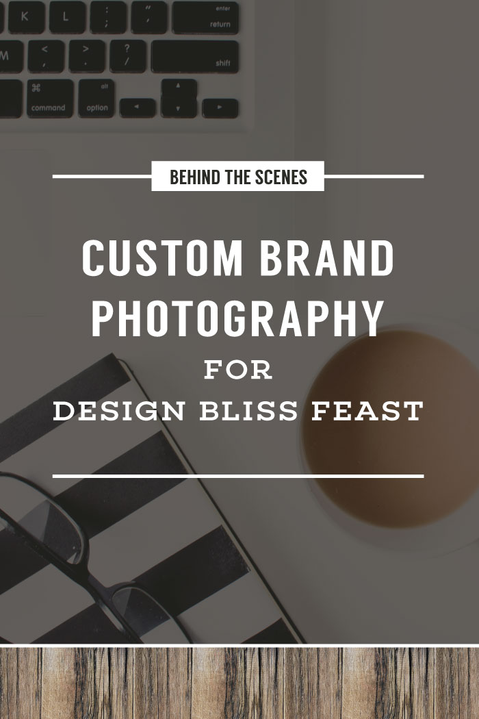
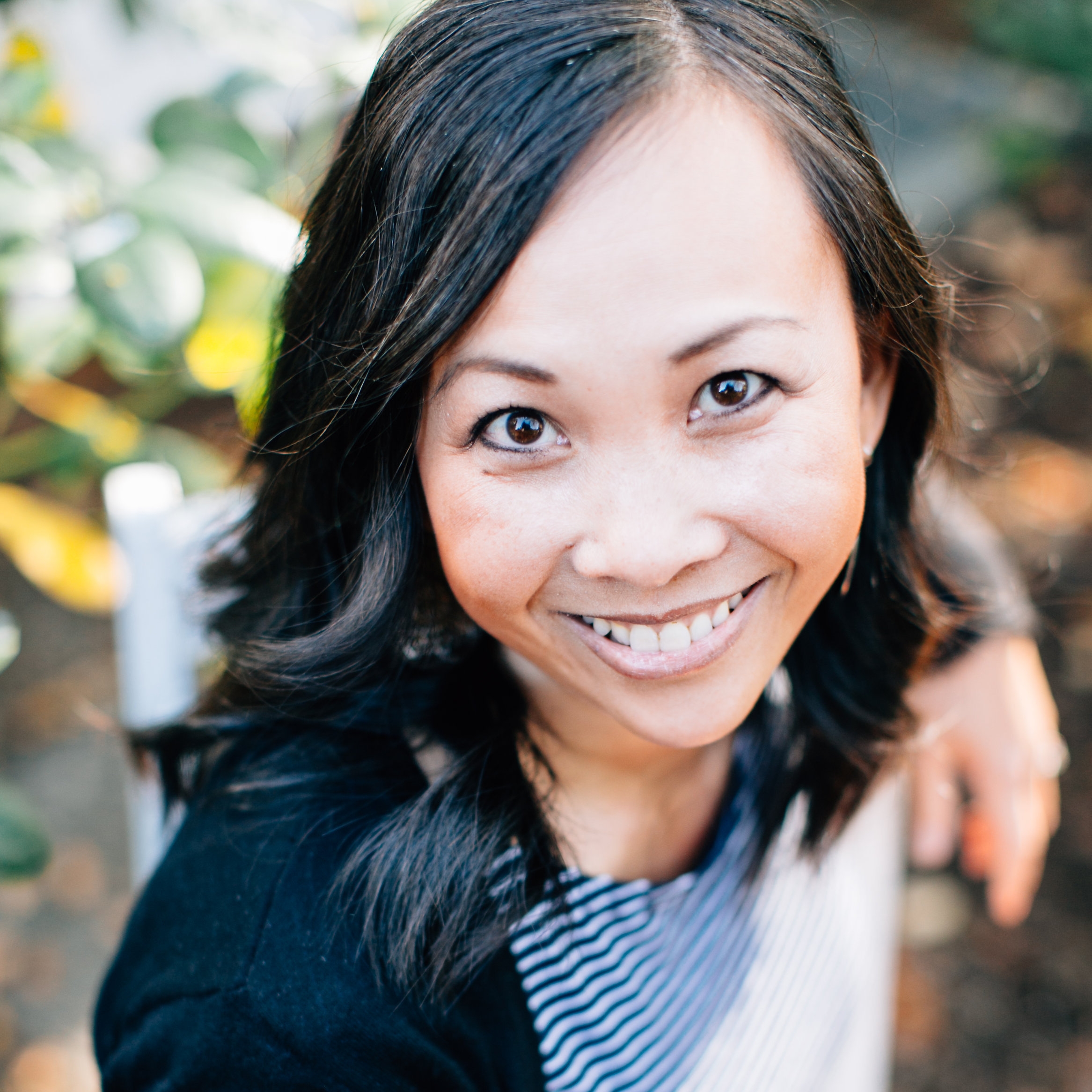
When Sadaf at Design Bliss Feast approached me about doing custom brand photography for her graphic design business, I was delighted to take on the project. I was drawn to her minimal and modern brand, which is a bit of a tangent from my usual earth tones and vintage vibe.
We started her project like I do with all my clients: with the inspiration board. She pinned a bunch of images to a secret Pinterest board where I combed through for photos and images that had a common theme.
It was clear from her pinned images that she had a very strong vision for her brand. Here is her final inspiration board. I use these boards to give me a direction in which to source props and the style I need to keep in mind as I style her photos.
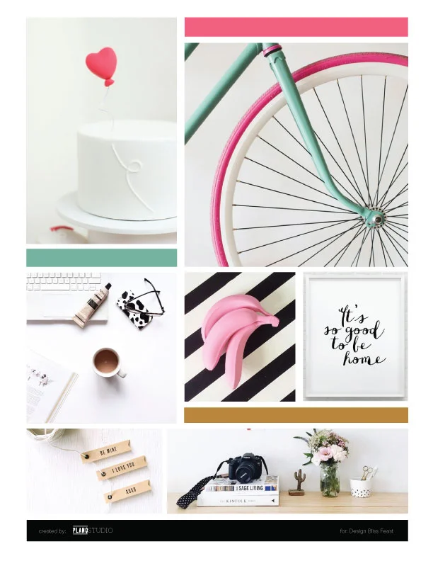
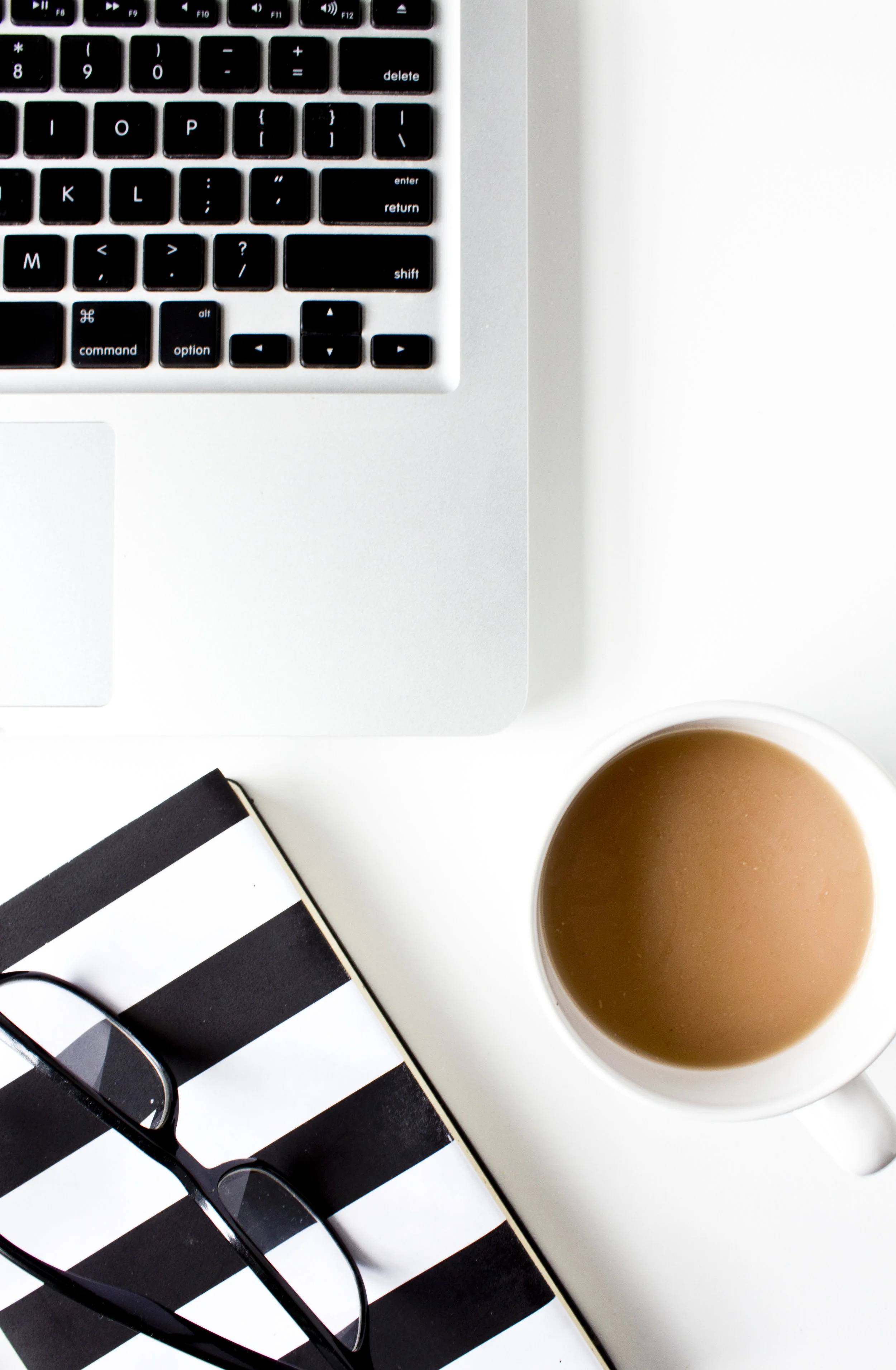
Sadaf's brand called for black and white with hints of pink and aqua/seafoam. She wanted images that were creative and professional with a feminine appeal. In our communication, she emphasized her love of white space, so I made sure her custom stock photos had plenty of it.
Sadaf intended to use these photos on her website to highlight the type of work she does for her clients. I kept the subject matter to desk environments, adding personal touches where I could.
Specifically, she asked for the following props to make appearances in her photos:
- Black framed eyeglasses
- Cup of tea with milk
- White notebook
- Laptop and phone
- Mockup imagery for her hand lettering


I loved styling these photos because I used my creative noodle on a few props to get her images just right. I had a hard time finding the perfect shade of pink and aqua in her props. Part of my brand photography process includes sending unstyled and unedited shots of the props to my client, so I had her approval of this tweak in colors before I scheduled the photo shoot.
There were also some challenges in sourcing props for this project, which I share with you below, but I think that overall, it turned out really well in the end!
Some notable prop hacks for this project:
- DIY tea bag tag. To mimic the heart in her inspiration board, I replaced the tag on the tea bag with a custom pink heart tag. This was easily accomplished with some pink scrapbook paper and a customized template.
- Customized notebook. I know Sadaf asked for a white notebook, but this is one of those times when you as a prop stylist have to make a call as to what would look best in the final images for your client. A white notebook on a white background would just disappear.
I wanted to make a bolder statement with the notebook by using the wide black and white stripes from her inspiration board. I thought to find a book with these stripes on the cover. How hard could it be to find one? Unbelievably hard! Did you know that?
Since I work on a 2-week turnaround time for my clients, I was wasting valuable time searching for the perfect notebook. That's when I decided to DIY this prop.
I drew up the black and white pattern in Illustrator and printed it out on 8.5 x 11 copy paper. Then I wrapped a plain black notebook in my prop library with it. Because the paper was too small, the notebook is not entirely wrapped in the striped pattern - just the front cover and spine. Just enough.
- Black framed eyeglasses are another challenging prop to source. I couldn't believe how many places sold hideously overdecorated frames. Why is it always the simple items that no one ever carries? But you know where I did find the perfect pair? The dollar store. I'll just leave you to pick up your jaw off the floor now.
- Pink flowers. This photo shoot took place in December when fresh flowers were all buried away in the earth until spring. Sure, there were fresh things available at the florists - mostly branches, greenery and overly priced flowers that would have broke my profits if I went that route.
Oh, and I had to get pink flowers.
Seriously, for this color scheme and brand, no other color flower would work. And just plain green plants didn't whisper feminine enough. So, thank you grocery store for saving the day! Pink, yummy tulips were quickly snatched up and styled for these photos.
Tulips are just the perfect combination of modern, minimal, and feminine.
You can see my custom brand photos in action at Design Bliss Feast here.